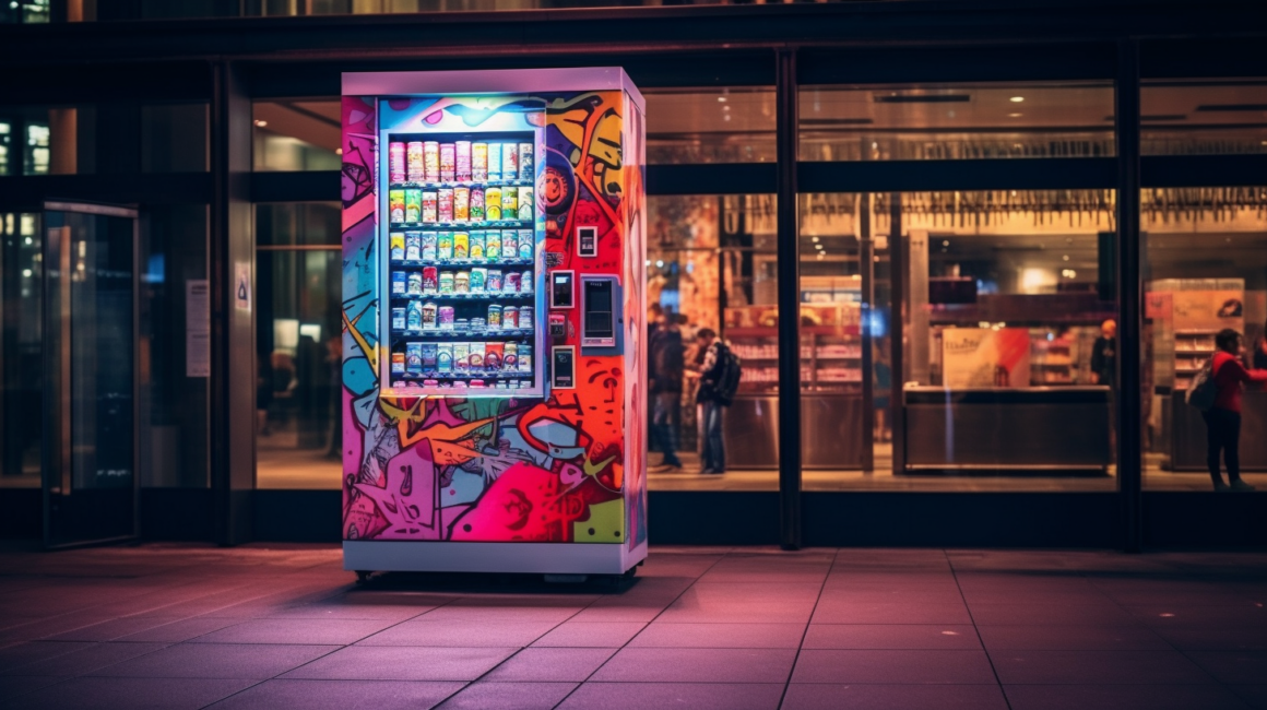
You’ve likely encountered a vending machine while strolling through an airport, shopping mall, or busy street corner. Designed for the fast-paced, modern world, vending machines offer a convenient way to purchase snacks, drinks, and many other products. But have you ever stopped to think about what drew you to that vending machine in the first place? You might attribute it just to thirst or hunger, but what about the machine’s aesthetic appeal? If you think aesthetics and design don’t matter when it comes to these standalone stores, think again.
The Visual Experience
First impressions count. Before you even approach a vending machine, your eyes unconsciously scan its appearance. Is it clean? Is it colorful? Does it appear high-tech or outdated? These subtle judgments are often made within seconds and can significantly impact your decision to engage with the machine. Companies have long understood the importance of these first impressions, investing in design elements like eye-catching graphics, interactive displays, and strategic color schemes to entice potential customers.
Colors and Branding
When you think about Coca-Cola vending machines, red probably comes to mind. This is no accident. A vending machine’s color scheme and branding play crucial roles in catching your attention. Brands leverage their color palette not just for consistency but also for emotional resonance. Studies have shown that colors can evoke specific feelings: blue for trust, red for excitement, green for health, etc. A wisely chosen color scheme can make a vending machine more than just a metal box; it becomes a visual representation of the brand’s values and ethos.
Interactive Elements
The advancement of technology has allowed vending machines to evolve from basic coin-operated boxes to interactive multimedia experiences. Touch screens, motion sensors, and even facial recognition technologies can make the purchasing process engaging and enjoyable. For example, some vending machines now allow you to customize your drink, mixing different flavors right before your eyes. This level of interactivity not only impresses customers but also adds a layer of personalization, increasing the likelihood of repeat visits.
Layout and Product Placement
The internal layout of a vending machine is just as crucial as its external appearance. Brands invest time and resources in figuring out optimal product placement within the machine. Generally, the top-selling items are placed at eye level to make them easily noticeable. Highlighting popular or new products can draw attention and motivate people to make a purchase even when they weren’t initially planning to do so. It’s not just about stacking products; it’s about presenting them in a way that visually appeals to consumers.
Lighting and Visibility
Lighting can make or break the customer’s experience. A well-lit vending machine enhances visibility and adds to its aesthetic appeal. Companies are now using LED lighting to illuminate the machine’s interior, showcasing the products in a visually appealing manner. When strategically placed, lighting can highlight special promotions or new products, serving as a silent salesperson that draws customers in.
User Experience
Ultimately, good design aims to improve the user experience. Ease of use, clarity in instructions, and simplicity in navigation are all design elements that can make or break a vending machine’s success. With technological improvements, we see vending machines offering multiple payment options, language settings, and quicker dispensing mechanisms. These features contribute to a seamless user experience, increasing customer satisfaction and the likelihood of return visits.
Final Thoughts
Whether through vibrant colors, interactive elements, optimal layout, thoughtful lighting, or an overall focus on user experience, a well-designed vending machine does more than dispense products—it offers a visually and functionally satisfying experience that customers will remember.


Leave a Reply